Coderx3 has been hard at work the last few days to add new features to VitaCord, fix bugs, and implement the new UI by Arkanite which now makes this Homebrew app completely in style with the normal Discord Client. Sure there are simple bugs here and there but I’m sure those will be fixed over time. So let’s start talking about what has been implemented since the last time we spoke about VitaCord.
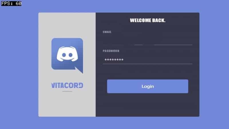
V 1.05:
Added multithreading, so messages in the channel will be loaded in the background and not block everything:)
Password is now hidden with eight asterisks (*) .
Some simple wordwrap (won’t work with words longer than a line yet )
V 1.06:
Due to rendering too far I guess it crashed . Y axis was like 5300 + in vita2d_font_draw_text()
So I added an if(y < MAX_Y && y > MIN_Y)
Keyboard is now fixed
DM scrolling is buggy….
So quite a few things have been adjusted, bugs have been fixed and features by the community have been added. So what’s new in the newest test version? I’m reading these things either out of the commits or through Questions so I may get a few things wrong. Apologies for that.
A message has been added if you type the wrong password in the Login Screen.
Emojis have been deleted for now. Haven’t been really implemented yet anyway.
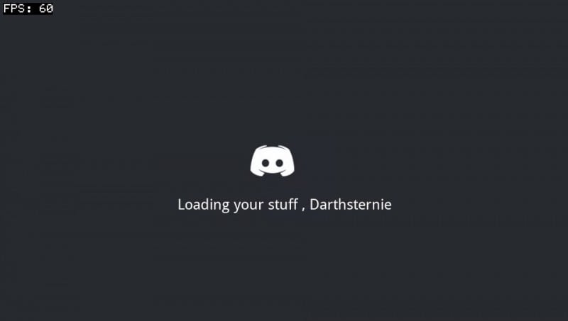
A new loading screen. (It’s even animated like in original Discord :D)
Changed the Livearea screen to show a register Discord Account button.
If I forgot anything I’ll try to add it but now let’s have a look at the beautiful new UI done by Arkanite. As you could already see the Login Screen now says Vitacord instead of discord and has been adjusted just a tiny bit and the loading screen is now animated with the original loading screen. But let’s focus on the Normal UI now.
After the loading screen you will be greeted with the list of Servers you are connected to

That UI looks really stunning and really nice now. There are still a few bugs with the Server names being too long and going over the left side but that will probably be fixed soon so let’s tap on one of the servers to select a channel.
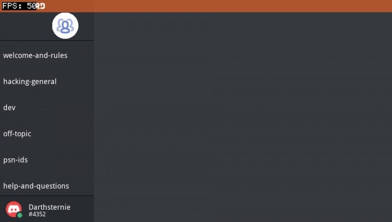
The UI nicely lists all of the Channels and you can easily access one by also tapping on it.
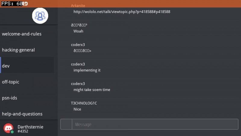
Well, there we are with the messages. As we can see it has problems with the names of some users and doesn’t show their Profile Icons but hey, this is still a test version :).
So let’s write a message.
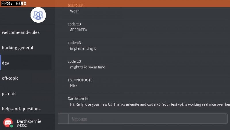
The UI still has problems with properly breaking Messages into multiple lines but I as always, this is a test version 🙂
Lastly let’s do a simple comparison between the PC Client and the Vita client.
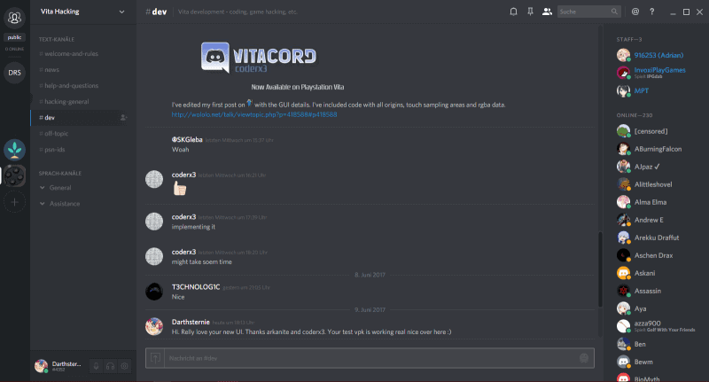


I, for my part, am really stunned about the nice look of the UI now and can’t wait to see how VitaCord will mature and maybe one day replace the Party app for some of us who don’t want to go online with their Vitas 🙂
If you want to test this VitaCord version now just download the VPK from the official repository and install it with VitaShell or MolecularShell.
Source: Github
 Hackinformer Your device needs to transform, we are here to inform
